< C++ .NET Windows Form 3 | Main | C++ .NET Windows Form 5 >
Windows Forms 4
There are a couple of items in the table worth explaining in more detail. Labels do participate in the tab order on forms but don't usually receive the focus. If you want to give the focus to a label for some reason, set the TabStop property to true. In addition, ampersand (&) characters normally aren't interpreted as access keys as they are in menus, where the presence of an ampersand underlines the following character rather than displays the ampersand. If you want ampersands to be interpreted as access keys, set the UseMnemonic property to true. Labels can display an image as well as (or instead of) text, and the Image property represents the image currently associated with the label. You can also use images stored in ImageList controls, via the ImageList and ImageIndex properties. The following exercise shows you how to add a label to a form and how to manipulate the label's properties.
25. Continue using the CppForm project. Open the Toolbox, and drag a Label onto the form. You can leave the control Name as label1 (default).
26. Set the Text of the label to Your_Name Consulting, Inc., replacing Your_Name to your nick name and set its AutoSize property to true. If you have
carried straight on from the previous exercise, you will need to press the Properties button at the top of the Properties editor so that it displays properties instead
of events.
The following Table summarizes the properties and respective values.
| Properties | Value |
| Name | label1 |
| Text | '' My Consulting, Inc |
| AutoSize | true |
| ForeColor | ControlText |
| Font: Name Italic Size |
Verdana true 16 |
| Location | 20, 20 |
| Image | |
| ImageAlign | MiddleLeft |
|
Table 6 | |
27. Make sure that there are three spaces before the word Your_name; you are going to display an image at the left of the label, and you need to leave space so that it doesn't overlap with the start of the text. Setting the AutoSize property to true means that the label will resize itself to contain whatever text is assigned to it.
28. Now set up the font details for the label. Check that the ForeColor property is set to ControlText, which defaults to black. Then find the Font property, and click the plus sign (+) to the left to expand the Font property items. Use the drop-down list to set the Name to Verdana, set Italic to true, and set the Size to 16.
29. Set the Location of the label1 to be 20, 20.
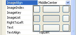
30. Now add an image to the label. Find the Image property in the Properties editor, and use the Browse button to find a suitable bitmap for display. You can use the following bitmap of a floppy disk, called Floppy.bmp, . When you have selected the image, set the ImageAlign property to MiddleLeft, which specifies middle alignment vertically and left alignment horizontally. When you click the down-arrow button to the right of the ImageAlign value, you will be given a graphical way to choose the alignment.
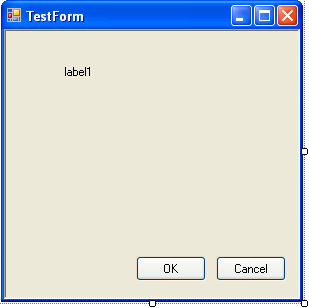
31. Build and run the program, and you'll see a label containing text and an image being displayed at the top of the form, as shown in the following figure.

Button
You've already met the Button class earlier in the module, and you've seen how to add buttons to forms. A Button represents a Windows button on a form and, next to Label, it's probably the simplest of the commonly used Windows controls. The most frequently used properties of the Button class are listed in the following table.
| Button Property | Description |
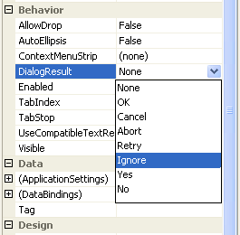
| DialogResult | Represents the value that is returned to the parent form when the button is clicked. |
| FlatStyle (inherited from ButtonBase) | Determines whether the button is drawn with a flat style. |
| Image (inherited from ButtonBase) | Gets or sets the image displayed on the button. |
| ImageAlign (inherited from ButtonBase) | Gets or sets the image alignment. The default value is MiddleCenter. |
| IsDefault (inherited from ButtonBase) | Determines whether the button is the form's default button. |
| TextAlign (inherited from ButtonBase) | Gets or sets the alignment of the text on the button. |
|
Table 7 | |
A button on a form can be designated the default button, in which case it is displayed with a darker border than other buttons on the form. If the user presses Enter, it's taken to be equivalent to clicking the default button. Forms that are used as dialog boxes use buttons to close the dialog box and return a value to the caller. The DialogResult property can be used to assign a result code (such as OK or Cancel) to the form, and clicking a button that has a DialogResult set will close the parent form without you having to hook up any event handlers.
 |
Part 1 | Part 2 | Part 3 | Part 4 | Part 5 | Part 6