< C++ .NET Windows Form 5 | Main | C++ .NET WinForm, Dialog Box & Controls 1 >
Windows Forms 6
TextBox
The System::Windows::Forms namespace has two edit control classes, both of which are derived from TextBoxBase. We'll look at TextBox in this section, and you'll find the more advanced RichTextBox class covered in Module 22. A TextBox is a Windows edit control that provides a number of methods and properties to manipulate the text inside the control. TextBox actually inherits most of its methods and properties from TextBoxBase, and the following two tables list some of the most commonly used inherited members. |
| Property | Description |
| AcceptsTab | If true, the Tab key will enter a tab character into the control instead of moving to the next control in the tab order. The default is false. |
| AutoSize | If true, the control automatically resizes itself to fit its text. The default is true. |
| BackColor, ForeColor | Represents the background and foreground colors. |
| BorderStyle | Represents the border style. The default is Fixed3D. |
| CanUndo | Set to true if the last operation can be undone. |
| HideSelection | If true, selected text in the control is dimmed when the focus passes to another control. |
| Lines | Gets or sets the collection of lines in a text box as an array of Strings. |
| MaxLength | Represents the maximum number of characters that can be typed into a control. The default value is 0, which means that the length is limited only by the available memory. |
| Modified | Gets or sets a Boolean value representing whether the control's content has been modified. |
| Multiline | If true, the control is a multiline text box. |
| PreferredHeight | Gets the preferred height in pixels for the current font. This enables you to size the text box so that it displays text correctly. |
| ReadOnly | Gets or sets the read-only status of the control. |
| SelectedText | Represents the currently selected text. |
| SelectionLength | Gets or sets the length of the selection. |
| SelectionStart | Gets or sets the start of the selection. |
| Text | Gets or sets the text displayed in the control. |
| TextLength | Gets the length of the text in the control. |
| WordWrap | If true, multiline text boxes will word-wrap as necessary. If false, they will scroll horizontally until a newline character is reached. |
|
Table 14 | |
| Method | Description |
| AppendText | Appends text to the control. |
| Clear | Clears the text in the control. |
| ClearUndo | Clears the most recent operation from the control's undo buffer. |
| Copy | Copies the selected text to the clipboard. |
| Cut | Cuts the selected text to the clipboard. |
| Paste | Replaces the current selection with the contents of the clipboard. |
| ScrollToCaret | Scrolls the control so that the caret is visible. |
| Select | Selects text in the control. |
| SelectAll | Selects all the text in the control. |
| Undo | Undoes the last clipboard or text change operation. |
|
Table 15 | |
Text boxes can be single-line or multiline, which is controlled by the Multiline property. Multiline text controls will use newline characters to break lines, whereas single-line controls will display newline characters as control characters (which usually display as a short vertical bar). The Lines property holds an array of Strings that is used to represent the lines in a multiline edit control. Text controls maintain an undo buffer, so it's possible to undo changes. Because it's possible to clear the undo buffer, you should check the CanUndo property before trying to undo operations. The TextBox class adds several properties to the ones it inherits from TextBoxBase, as shown in the following table.
| Property | Description |
| AcceptsReturn | If true, the Enter key will create a new line in a multiline text box instead of activating the default button for the form. The default is true. |
| CharacterCasing | Determines whether the control modifies the case of characters as they are entered. The values can be CharacterCasing::Normal (the default), CharacterCasing::Upper, or CharacterCasing::Lower. |
| PasswordChar | If set to a value other than 0, masks the characters with the specified value as they are typed. The default is 0. |
| ScrollBars | Determines whether a multiline text box displays with scroll bars. The default is no scroll bars. |
| TextAlign | Represents the text alignment. The default is HorizontalAlignment::Left. |
|
Table 16 | |
The following exercise shows you how to add an edit control to the form and manipulate the text it contains.
46. Open the CppForm project, if it isn't already open. The form was created with the default size of 300 by 300 pixels. To create more space to display a text box, set the form's Size property to 456, 400 to give enough space to display the text box next to the group box or you just can drag the edge of the form in the design page to resize it. Select both the OK and Cancel buttons, and drag them to the lower- right corner of the form. Reposition combo1 by setting its Location property to 256, 72.

47. Drag a TextBox from the Toolbox onto the form.
48. Position the text box just to the right of the group box and below the combo box, and use the Properties editor to set the Multiline property to true so that it can display more than one line of text. Then its Size to 100, 150.


49. Let's arrange for the text in the text box to be filled in automatically when the user clicks the radio buttons. To do so, you need to add a handler for the radio buttons. Select all three radio button objects (using mouse or selecting with mouse click while holding down the Ctrl button), and then open the Properties editor. Click the Event button to display the events, and double-click in the blank space next to the Click event. One event handler will be added that will apply to all three radio buttons. Event handler functions always have a name of the form control_event (radioButton3_Click in this case). Depending on the order in which you select the radio buttons, you will see the name of one of the buttons used in the event handler name. In this case, this was the third radio button, but the handler still applies to all three buttons. Fill in the event handler function the following code:
private: System::Void radioButton3_Click(System::Object^ sender, System::EventArgs^ e)
{
if (sender == radioButton1)
textBox1->Text = "You have selected the Visual Basic option.";
else if (sender == radioButton2)
textBox1->Text = "You have selected the C# option.";
else if (sender == radioButton3)
textBox1->Text = "You have selected the C++ option.\r\n More...";
}

The handler checks which of the radio buttons have originated the event and puts some appropriate text into the text box. The third radio button puts two lines of text into the text box, separated by a blank line. The \r\n acts as a line break. If you haven't seen it before, putting two string literals next to one another on adjacent lines isn't an error. If the C++ preprocessor sees two literals next to one another, it automatically concatenates them into one before sending the string to the compiler. This functionality makes a neat way to split long string literals across lines.
50. Build and run the program. You should now be able to click the radio buttons on the form and see text displayed in the text box.

Using Menus
Menus are a well-known feature of most GUI programs, and the Forms namespace contains a complete set of classes for building and working with menus. Menus in Windows Forms applications are represented by two main classes: MainMenu represents the menu bar that sits at the top of a form, while MenuItem represents all the items that make up the menus attached to a MainMenu. A MainMenu has a collection of MenuItems, and to model the hierarchical nature of menus, MenuItems themselves can have collections of other MenuItems. In use, menu items bear some similarity to buttons: they are both distinguished by their text, and both fire a Click event when they are selected. It probably won't surprise you to learn that you set up handlers for menu items in exactly the same way as you do for buttons.
Menu Design
There are a number of well-established guidelines relating to how menus ought to be constructed and presented to the user, and we'll give a brief outline of some of the more important ones here. First, it is convention that the leftmost menu on the menu bar is called File and the last item on the File menu is the one that exits from the program. It's usually called Exit. Likewise, the rightmost item on the menu bar should be the Help menu, which will contain entries to help the user access the Help system and probably an entry to show the program's About box. Menu items that are going to display a dialog box should end with an ellipsis (...); for example, About.... Menu items that are going to have an immediate action, such as exiting the application, shouldn't use an ellipsis. To help users navigate around menus, assign access keys to menus by putting an ampersand before one of the letters in the menu caption; for example, &File associates the access key F with this menu item. Users can navigate through menus by holding down Alt and typing the access keys. You can also assign shortcuts to individual menu items, such as Ctrl+P for print, and these should be added to the most frequently used menu items. Drop-down menus shouldn't be too long; any more than 10 entries are probably excessive. Consider using hierarchical menus. Menus shouldn't let the user do anything that isn't sensible. For example, if there are no files open, an application shouldn't let the user select the Print option. There's nothing to print, so it's just confusing to be able to select the item. It's good practice to dim (disable) menu items that don't apply in the current context. Some applications dynamically add and remove menu items, but this tends to lead to confusion because users can't remember how to make a particular menu item reappear!
The following exercise will show you how to add a simple menu to the application's main form.
51. Continue working with the same project you've been using throughout this module.
52. Drag a MenuStrip from the Toolbox, and drop it onto the form. You will see that an icon labeled as menuStrip1 is displayed in a special area at the bottom of the designer screen.

Controls that have no visible presence on the form display in a separate area at the bottom of the designer. Only controls that can be seen at run time display on the form.
53. You will see a menu-like feature has been added to the top of the form, with a rectangle toward the left that contains the text Type Here. Click in that rectangle, and type &File to add a menu item.
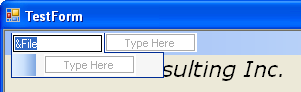
54. Once you've typed the entry, you will see that two more Type Here boxes appear. The one to the right is to add more items to the menu bar, while the one below is to add more items to the File menu. Add &About... and E&xit items to the File menu.
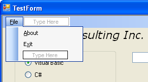
55. Select the About menu item, and bring up the Properties editor. Change the name of the About menu item to aboutMenuItem. Change the name of the Exit menu item to exitMenuItem.
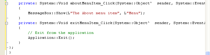
56. You provide menu items so that the user can select them and execute code. Double-click the About menu item to add a handler, and add the following code to the function:
private: System::Void aboutMenuItem_Click(System::Object^ sender, System::EventArgs^ e)
{
MessageBox::Show(L"The About menu item", L"Menu");
}
57. Add a second handler for the Exit menu item, but this time use it to exit from the application.
private: System::Void exitMenuItem_Click(System::Object^ sender, System::EventArgs^ e)
{
// Exit from the application
Application::Exit();
}
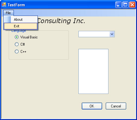
58. Build and run the program. You should see that the form now has a menu bar at the top, and you should be able to select the menu items. Test both menus.
|
More About Menus
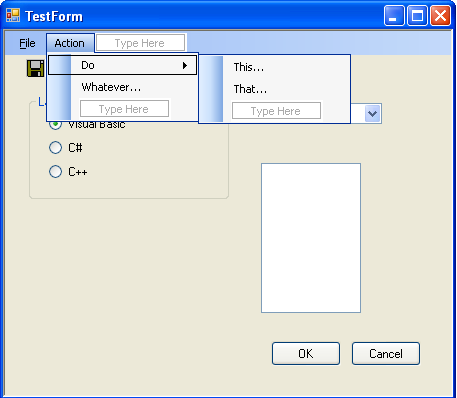
Now that you've mastered the basics of adding menu support to programs, We'll briefly mention some of the other features of the menu classes. First, you can create hierarchical menus. Each menu item has a Type Here box to its right, and you can use this box to start a new hierarchical menu. The following figure shows the added menu and menu items just for illustration without any action for the click event.
|
59. To add a separator bar to a menu, select the menu item above which you want the separator. Right-click the item and select Insert Separator from the context menu. The following figures show the steps.


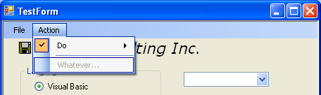
The Checked and Enabled properties can be used to display a check mark next to a menu item and to dim menu items that aren't currently active. Simply set the requisite property to true or false in the Properties editor, as required. Note that the Properties editor gives you a way to set the initial values of properties. You can always change them later programmatically. The following figures show setting the Checked to true for the Do menu item and Enabled to false for the Whatever' menu item.


60. When you build and run your project the Do menu item will be ticked and the Whatever' menu item will be disabled.
Displaying a Context Menu
Most GUI applications nowadays use context menus, small menus that pop up when you right-click over a window and that are used to provide menu items specific to that part of the GUI. You can easily add a context menu to a form by creating a ContextMenuStrip object, adding menu items to it, and then assigning it to the form's ContextMenu property. The following exercise shows you how to add a context menu to a form.
61. Continue working with the same project you've been using throughout this module.
62. Drag a ContextMenuStrip from the Toolbox onto the form. It will display at the bottom of the form, next to the menuStrip1.

63. Add some items to the ContextMenuStrip in the same way that you did for the main menu. You will see that the menu items display at the top of the form, as if you were editing a main menu. Add three menu items: One, Two and Three vertically shown below. There are no events fired for those menu items.

64. Assign the context menu to the ContextMenuStrip property of the form, using the Properties editor. Select the form, go to the Properties editor and assign contextMenuStrip1 value to the ContextMenuStrip property.

65. Build and run the code. You'll find that you can display the context menu by right-clicking the form.

66. Adding an image to menu item. In the designer, select One context menu item. In the Properties Editor, browse a Folder.bmp image by clicking the ellipses (') of the Image property and set the ImageAlign property to MiddleLeft.

67. Build and run your project. You have menu item with an image. You use handlers with items on context menus in exactly the same way as with main menus.

Well this introduction module to the Windows Form should provide you enough motivation to explore more!
Very Quick Reference
| To | Do this |
| Create a form. | Derive a class from System::Windows::Forms::Form. |
| Add controls to a form. | Drag controls from the Toolbox, and drop them onto the form. |
| Handle events. | Use the Properties editor to add an event handler. |
| Add a menu to a form. | Drag a MenuStrip item onto the form, and add menu items using the graphical menu editor. |
| Add a context menu. | Drag a ContextMenuStrip onto the form, in exactly the same way that you'd add a MenuStrip. |
|
Table 17 | |
Part 1 | Part 2 | Part 3 | Part 4 | Part 5 | Part 6