< C++ .NET Windows Form 4 | Main | C++ .NET Windows Form 6 >
Windows Forms 5
CheckBox and RadioButton
If you look at the .NET Framework documentation, you'll find that Button, CheckBox, and RadioButton all have the same base class, ButtonBase.
This shared base class is because all three classes are different types of button, each sharing the same on/off functionality but contributing their own special characteristics.
| |||||||||||||||||||
CheckBox and RadioButton can both fire events when the Appearance and Checked properties change, and CheckBox also fires an event if the CheckState changes.
Using Radio Buttons as a Group
It's common to use radio buttons to let users select one of a set of options. To do so, you provide a set of radio buttons inside a group box control; the group box not only encloses the buttons visually, but also makes them act as a group, ensuring that when any one is selected, the others are deselected. The following exercise shows you how to set up a group box containing radio buttons on a form.
32. Continue with the CppForm project. Open the Toolbox, and drag a GroupBox, under Containers control category onto the form. Use the Property editor to change its Text to read Language, its Size to 200, 104, and its Location to 24, 64.
| Properties | Value |
| Text | Language |
| Size | 200, 104 |
| Location | 24, 64 |
|
Table 9 | |
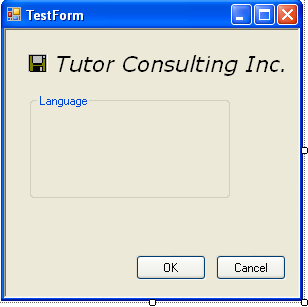
33. Drag a RadioButton onto the form, and drop it inside the group box. You will see that the group box clips the radio button so that no part of the button shows outside the border of the group box. Position the radio button toward the top of the group box, and set its Text to Visual Basic.
34. Add another two radio buttons to the group box, positioning them below the first. Set their Text properties to C# and C++, respectively.
35. Build and test the application. You should see the radio buttons displaying inside the group box, and you should find that when you select one button, all the others are unchecked.

36. By default, none of the buttons are checked when the application starts. To start with one of the buttons checked, use the Properties editor for the Visual Basic radio button to set its Checked property to true.

37. Build and run your application. The Visual Basic radio button will be checked at the beginning.

ListBox and ComboBox
List boxes and combo boxes are common features of Windows applications, each representing a scrollable list of items. The ComboBox class differs from the ListBox class in that ComboBox is able to display an item in a TextControl above the list. These two classes have many features in common because they both derive from the ListControl class, which provides some common functionality. The table below shows commonly used properties of the ListBox class.
| Property | Description |
| ColumnWidth | Gets or sets the width of columns in a multicolumn list box. |
| HorizontalScrollbar | Gets or sets a value indicating whether the control displays a horizontal scroll bar. |
| IntegralHeight | Set to true if the ListBox should resize itself so that it doesn't show partial items. |
| Items | Represents the collection of items held in the list box. |
| MultiColumn | Set to true if the list box supports multiple columns. The default is false. |
| PreferredHeight | Gets the combined height of all items in the list box. You can use this to resize the list box so that all items display without vertical scroll bars. |
| ScrollAlwaysVisible | If set to true, the vertical scroll bar will always be visible. |
| SelectedIndex | Represents the zero-based index of the currently selected item, or -1 if there is no selection. |
| SelectedIndices | For multiselection list boxes, represents a collection of the indexes of all the items currently selected in the list box. |
| SelectedItem | Gets or sets the currently selected object in the list box. |
| SelectedItems | For multiselection list boxes, represents a collection of all the items currently selected in the list box. |
| SelectionMode | Represents the selection mode of the list. (SelectionMode is discussed in the following text.) |
| Sorted | Set to true if the items in the list box are to be sorted. The default is false. |
| Text | Represents the text of the currently selected item in the list box. If you set this property to a string, the control searches for the first item that matches the string and selects it. |
| TopIndex | The index of the top item visible in the control. |
|
Table 10 | |
The SelectionMode property represents the way users can select items from the list and can take one of the following values from the SelectionMode enumeration:
-
SelectionMode::None, meaning that the user cannot select any items.
-
SelectionMode::One, meaning that the user can select one item at a time. This is the default value.
-
SelectionMode::MultiSimple, meaning that the user can select more than one item at a time.
-
SelectionMode::MultiExtended, meaning that the user can use the Shift, Ctrl, and arrow keys to make selections.
ListBox also supports a number of methods, the most commonly used of which are summarized in the table below.
| Method | Description |
| BeginUpdate, EndUpdate | BeginUpdate prevents the list box from redrawing until EndUpdate is called. This improves the performance when adding several items. |
| ClearSelected | Deselects all the items in a list box. |
| FindString, FindStringExact | Finds the first item in the list box that starts with a given string or that exactly matches a given string. |
| GetSelected | Returns true if the item with the specified index is selected. |
| SetSelected | Sets or clears the selection for an item in the list box. |
|
Table 11 | |
The main event fired by the ListBox class is the SelectedIndexChanged event, which is fired when a user selects a new item in the list. The ComboBox class has a similar set of methods and properties, as outlined in the two tables below.
| Property | Description |
| DropDownStyle | Represents the style of the combo box. |
| DropDownWidth | Represents the width in pixels of the drop-down box. |
| DroppedDown | Set to true if the list portion is currently displayed. |
| IntegralHeight | Set to true if the combo box should resize itself so that it doesn't show partial items. |
| Items | Represents the collection of items held in the combo box. |
| MaxDropDownItems | Represents the maximum number of items in the drop-down list. The value must be between 1 and 100. |
| MaxLength | Represents the maximum length of the text in the text box. |
| SelectedIndex | Gets or sets the zero-based index of the currently selected item. The value is -1 if there is no selection. |
| SelectedItem | Gets or sets the currently selected item. |
| SelectedText | Represents the currently selected text in the text box portion of the combo box control. |
| SelectionStart, SelectionLength | Gets or sets the start position and length of the selected text in the text box portion of the combo box control. |
| Sorted | Determines whether the list in the combo box is sorted. |
| Text | Gets or sets the text in the text box portion of the combo box control. |
|
Table 12 | |
A combo box can have one of the following three Styles:

-
ComboBoxStyle::DropDown, where the text box can be edited and the user must click the arrow to display the list. This is the default style.
-
ComboBoxStyle::DropDownList, which is the same as DropDown, with the exception that the text box can't be edited.
-
ComboBoxStyle::Simple, where the text box can be edited and the list is always visible.
| Method | Description |
| BeginUpdate, EndUpdate | BeginUpdate prevents the combo box from redrawing until EndUpdate is called. This improves the performance when adding several items. |
| FindString, FindStringExact | Finds the first item in the combo box that starts with a given string or that exactly matches a given string. |
| Select | Selects a range of text in the text box portion of the combo box. |
| SelectAll | Selects all the text in the text box portion of the combo box. |
|
Table 13 | |
As with ListBox, the main event fired by the ComboBox class is the SelectedIndexChanged event, which is fired when a user selects a new item in the list. The following exercise will show you how to set up a combo box and respond to the events it fires, and you'll find that list boxes work in very much the same way.
38. Open the CppForm project if it isn't already open.
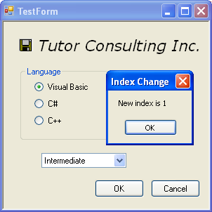
39. Drag a ComboBox from the Toolbox onto the form, and change its Name to combo1.
40. Set the DropDownStyle to DropDownList, which means that the user has to click the button to the right of the text box to display the list, and that the text in the text box can't be edited. The Text property is blanked out automatically.
41. To add some strings to the combo box using the Properties editor, first find the Items property. Click the browse button to the right of the (Collection) string, which will display the String Collection Editor. Type in three values - Beginner, Intermediate, and Advanced - one per line, and press OK to dismiss the editor when you're done.

 |
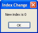
42. To display the first string in the combo box when the application starts, you need to set the SelectedIndex property. This cannot be done using the Properties editor, so add the following line of code to the Form1 constructor in Form1.h, immediately after the call to InitializeComponent. (This step just as an illustration to show how we can do the code editing of the source code and can be skipped.)
combo1->SelectedIndex = 0;

43. When you build and run the application, the following message box will be displayed first before the main form.
44. The SelectedIndexChanged event will be fired whenever the user selects a new item in the drop-down list. Use the Properties editor to display the events for the combo box by pressing the Event button at the top of the editor, the one marked with a lightning symbol. Find the SelectedIndexChanged event, and double-click in the blank right-hand column. A handler function will be added to the form class. Edit the handler code as shown here:
private: System::Void combo1_SelectedIndexChanged(System::Object^ sender, System::EventArgs^ e)
{
if (sender == combo1)
{
String^ ps = String::Concat(L"New index is ", (Object^)(combo1->SelectedIndex).ToString());
MessageBox::Show(ps, L"Index Change");
}
}
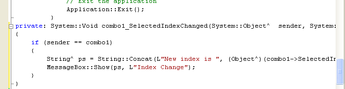
The function checks that the sender was combo1, and if so, it builds a String containing the index of the new selection. The String is built using the static Concat function from the String class, and to convert the SelectedIndex value from an integer to a String, it is first boxed so that ToString can be called on the resulting object. The final string is displayed in a message box so that you can be sure the selection has happened.
45. Build and run the project, and you'll see a combo box on the form that displays three items. You should also get a message box displayed whenever you select a new item.
Part 1 | Part 2 | Part 3 | Part 4 | Part 5 | Part 6