< C++ .NET WinForm, Dialog Box & Controls 5 | Main | C++ .NET WinForm, Dialog Box & Controls 7 >
Windows Form, Dialog Boxes and More Controls 6
ToolStripContainer Control
A ToolStripContainer has panels on its left, right, top, and bottom sides for positioning and rafting ToolStrip, MenuStrip, and StatusStrip controls. Multiple ToolStrip controls stack vertically if you put them in the left or right ToolStripContainer. They stack horizontally if you put them in the top or bottom ToolStripContainer. You can use the central ToolStripContentPanel of the ToolStripContainer to position traditional controls on the form. Any or all ToolStripContainer controls are directly selectable at design time and can be deleted. Each panel of a ToolStripContainer is expandable and collapsible, and resizes with the controls that it contains. Important ToolStripContainer Members are listed in the following Table.
| |||||||||||||||||||||
ToolStrip (previously known as Toolbars)
Although ToolStrip replaces and adds functionality to the ToolBar control of previous versions, ToolBar is retained for both backward compatibility and future use if you choose. Use ToolStrip and its associated classes in new Windows Forms applications to create toolbars that can have a Windows XP, Office, Internet Explorer, or custom appearance and behavior, all with or without themes, and with support for overflow and run-time item reordering. ToolStrip controls also offer a rich design-time experience that includes in-place activation and editing, custom layout, and sharing of horizontal or vertical space within a specified ToolStripContainer. ToolStrip is the container for ToolStripButton, ToolStripComboBox, ToolStripSplitButton, ToolStripLabel, ToolStripSeparator, ToolStripDropDownButton, ToolStripProgressBar, and ToolStripTextBox objects. While the ToolStrip class provides many members that manage painting, mouse and keyboard input, and drag-and-drop functionality, you can use the ToolStripManager class to join ToolStrip controls within a specified ToolStripContainer and merge ToolStrip controls with each other. Use the ToolStripRenderer class with the ToolStripManager class to gain even more control and customizability over painting and layout style. Use the ToolStripControlHost class to host any other Windows Forms control in a ToolStrip.
Using ToolStrip
ToolStrips are a standard feature of just about every GUI application, and the ToolStrip class provides everything you need to add toolbar functionality to an application. The ToolStrip class has a number of properties, as summarized in the following table.
| Property | Description |
| Anchor | Determines which edge of the container the toolbar is anchored to. |
| Appearance | Represents the appearance of the ToolBar, which can be Normal or Flat. The default is Normal. |
| AutoSize | Determines whether the ToolBar automatically resizes itself to fit the buttons. The default is true. |
| BorderStyle | Represents the border style of the ToolBar. The default is None. |
| Buttons | Gets the collection of ToolBarButton objects hosted by this ToolBar. |
| ButtonSize | A Size value that represents the size of the buttons on the ToolBar. The default is 24 pixels wide by 22 pixels high, or large enough for the button’s image and text, whichever is larger. |
| Divider | Determines whether this ToolBar displays a divider. The default is true. |
| DropDownArrows | Determines whether arrows are displayed next to drop-down buttons. The default is true. |
| ImageList | The list of images used on this ToolBar. |
| ImageSize | Gets a Size object representing the size of the images in the ImageList. |
| ShowToolTips | Determines whether ToolTips are shown for buttons. |
| TextAlign | Represents how the text aligns with respect to the images on buttons. The default is ToolBarTextAlign::Underneath. |
| Wrappable | Determines whether buttons will wrap to the next line if the ToolBar becomes too narrow. The default is true. |
|
Table 10 | |
Buttons on a toolbar are represented by ToolStripButton (previously known as ToolBarButton) objects, and this class also has several useful properties, which are summarized in the following table.
| Property | Description |
| DropDownMenu | Represents the menu associated with a drop-down button. |
| Enabled | Determines whether the button is enabled. The default is true. |
| ImageIndex | Represents the index of the image in the ToolBar’s ImageList that will be used for this button. The default is -1 (no image). |
| Parent | Gets a pointer to the ToolBar that is hosting a button. |
| PartialPush | Determines whether a toggle-style button is partially pushed. The default is false. |
| Pushed | Determines whether a button is currently pushed. The default is false. |
| Rectangle | Gets the bounding rectangle for a button. |
| Style | Represents the button’s style. The default is PushButton. |
| Tag | Represents any object that you want to be associated with the button. |
| Text | Represents the text on the button, if any. |
| ToolTipText | Represents the text to be displayed for this button’s ToolTip. The parent ToolBar’s ShowToolTips property must be true for ToolTips to be displayed. |
| Visible | Determines whether the button is visible. The default is true. |
|
Table 11 | |
ToolStripButtons can be displayed with one of the following four styles:
-
PushButton (the default), where the button simply acts as a pushbutton.
-
DropDownButton, where clicking the button drops down a menu.
-
ToggleButton, where the button toggles between its up and down states.
-
Separator, where the button acts as a separator between two other buttons. Like the separator on a menu, this style of button can’t be selected.
The ToolStrip class has two commonly used events: ButtonClick, which is fired when a button is clicked, and ButtonDropDown, which is fired when the menu of a drop-down button is about to be displayed. This exercise will add a ToolBar to the form. The bar will host two buttons: the first is a drop-down button with a menu, and the second is a standard pushbutton. You’ll also add a handler for the second button to learn how handlers are used with ToolBars.
38. Continue using the CppControls project you created earlier. First of all we need to put a ToolStripContainer. This will be a container for our ToolStrip. Drag a ToolStripContainer onto the form. Just select the Top panel for the visibility. Next, select Dock Fill in Form.

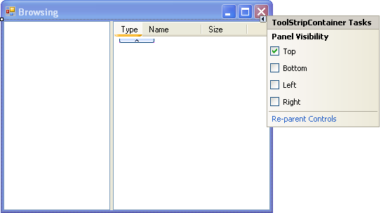
39. Next, select the Re-parent Controls.

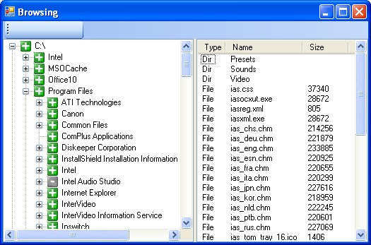
40. Drag a ToolStrip control onto the ToolStripContainer. It will fit nicely in the ToolStripContainer.

41. Build and run your project and the following is the output.
42. Back to the GUI designer and open the ToolStrip Tasks. Select Insert Standard Item that contains part of the standard Windows toolbar buttons: New, Open, Save, Print, Cut, Copy, Paste and Help.

---------------------------------------------------------------
---------------------------------------------------------------

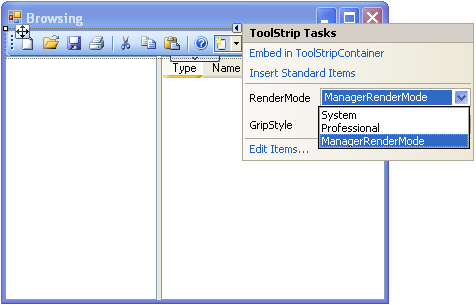
43. You can select System or Professional RenderMode property and Professional is the default. In this exercise, please select Professional RenderMode.
44. Other than editing the given Toolbar buttons properties, you can add more Toolbar buttons by selecting the ToolStrip Tasks’s Edit Items… shown below.
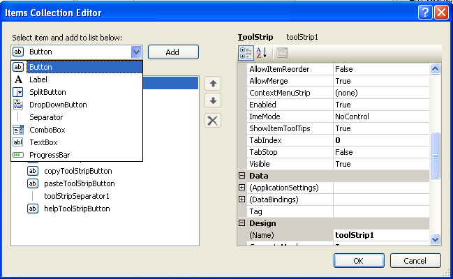
45. You can also add new button using the Add ToolStripButton dropdown button shown below.

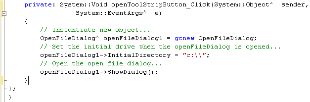
46. Let add code for the Open File dialog box so that when the button is clicked, an Open File dialog will be launched. Select the Open File button and select the event page of the Properties Editor. Double click on the empty field of the Click event and add the following code to the event handler.
private: System::Void openToolStripButton_Click(System::Object^ sender, System::EventArgs^ e)
{
// Instantiate new object...
OpenFileDialog^ openFileDialog1 = gcnew OpenFileDialog;
// Set the initial drive when the openFileDialog is opened...
openFileDialog1->InitialDirectory = "c:\\";
// Open the open file dialog...
openFileDialog1->ShowDialog();
}
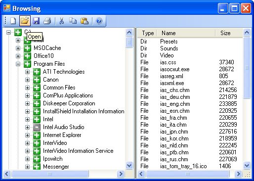
47. Build and run your application. Click the Open File button in the ToolBar. The following dialog box should be expected. Keep in mind there is no code for the handler when you select file and click the Open button.

Part 1 | Part 2 | Part 3 | Part 4 | Part 5 | Part 6 | Part 7